Need advice? Let's talk.
Get straightforward guidance from your broadcasting partner. Schedule a call to chat with the team about your radio station.
Book DemoHow to Design a Logo for Your Radio Station
Need a helping hand to design a radio logo for your station? Here's how you can create a good looking logo in no time.

First impressions are important, and your radio stations logo will be one of the first things your listeners see. It should immediately tell them clearly what station they are about to listen to and what you’re all about. This is why it’s important to get this right, so we’re going to give you a few pointers on how to create a good looking logo for your station.
Keep It Simple!

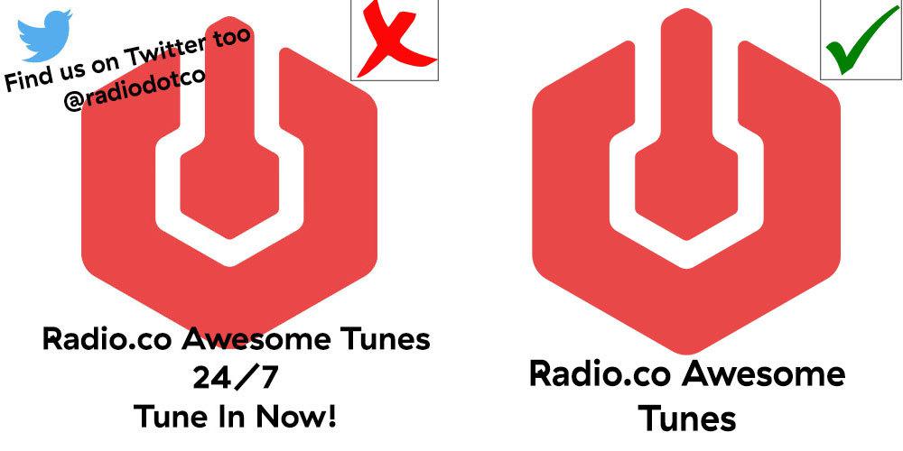
Your stations logo is most likely not going to be filling up your listeners phone screens or computer screens. It’s probably going to be relatively small on most displays. For this reason, don’t try and over clutter your logo with text or multiple images, as it will end up looking strange and confusing. Keep it simple and clean.
Make It Colourful!

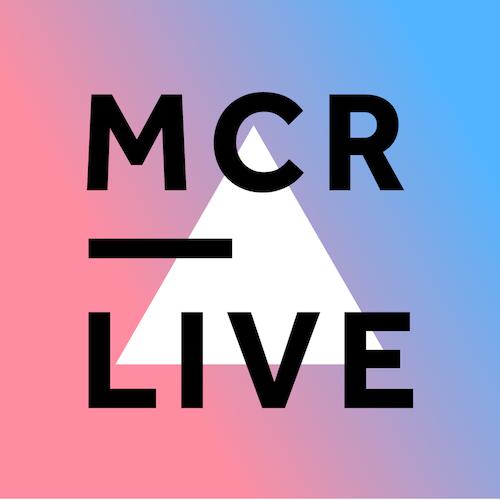
Colour is eye-catching and will make your station stand out amongst others in different directories. This doesn’t mean we want you to go crazy with colours, but perhaps picks a few colours that compliment each other nicely and use those. One example would be the MCR Live logo, that has utilised pinks and purples really nicely.
Choose Designs Carefully…
Graphics, colours, and fonts within your logo can instantly say a lot about your station to your listener so you want to make sure these represent your stations content as much as possible. You play rock music? Use an electric guitar with an amp. Talk station? Maybe just a simple microphone. All American music? Make everything red, white and blue! Just take a moment to think about the small details.
Stay Within Size Guides
For Radio.co, we ask that you make your station logos 500x500px in size. This means it will display nicely on Radio.co, but also these size parameters should look perfect on different radio directories as well, making it pretty universal. It should also prevent logos looking warped, blurry, or stretched out on any directory too.
If You’re Still Unsure?

If you still aren’t sure about how to create your own good looking logo for your station, there are people out there that can do this for you. Websites like Fiverr have plenty of people available who can create an awesome looking station logo for you for a reasonable price. There are also websites that allow you to use their library of stock graphics to create your own logo, like Graphic Spring.
If you have any other questions about anything else to do with your radio station, let us know by clicking the red speech bubble in the bottom right, or by emailing studio@radio.co


