Radio App Design: Why You're Doing It Wrong & How to Fix It
Is your radio app design terrible? Here's why it might be and how to fix it with this essential guide using good and bad app examples.

Radio App Design can be a daunting task. You might be struggling to make your App look professional. In this guide, I'm going to show you my top tips to create a clean looking app design using our Mobile App Builder available for iOS and Android devices.
Why Design iOS and Android Apps?
When designing your app, you need to keep your users in mind as they'll be the ones who have to use your app to listen to your radio station. In this day and age you cannot sacrifice on design. According to a study by Andrew Chen and Quettra, the average app loses 77% of its active users in the first 3 days after installing it. The apps that have this problem usually have the same thing in common - they're poorly designed in terms of look or the layout - so it's critical that your app is designed well and looks appealing to a potential listener.
I'll be using Adobe Photoshop to create the images I'll be using for my app. However, you can use whatever editing software you like, and there are some great free tools out there such as GIMP (Mac and Windows), Paint.NET (Windows) or even the built-in editors on your computer such as Paint (Windows) or Photos (Mac).
Designing Your App Icon
The first thing I'll be creating is the App Icon. The Icon needs to be 1024 by 1024 pixels in size, so make sure you set up your document to this size. Then, I'll start adding the content to my icon. Try and aim for a clean, polished look. In this case, less is more. For example, you want to avoid something like this:
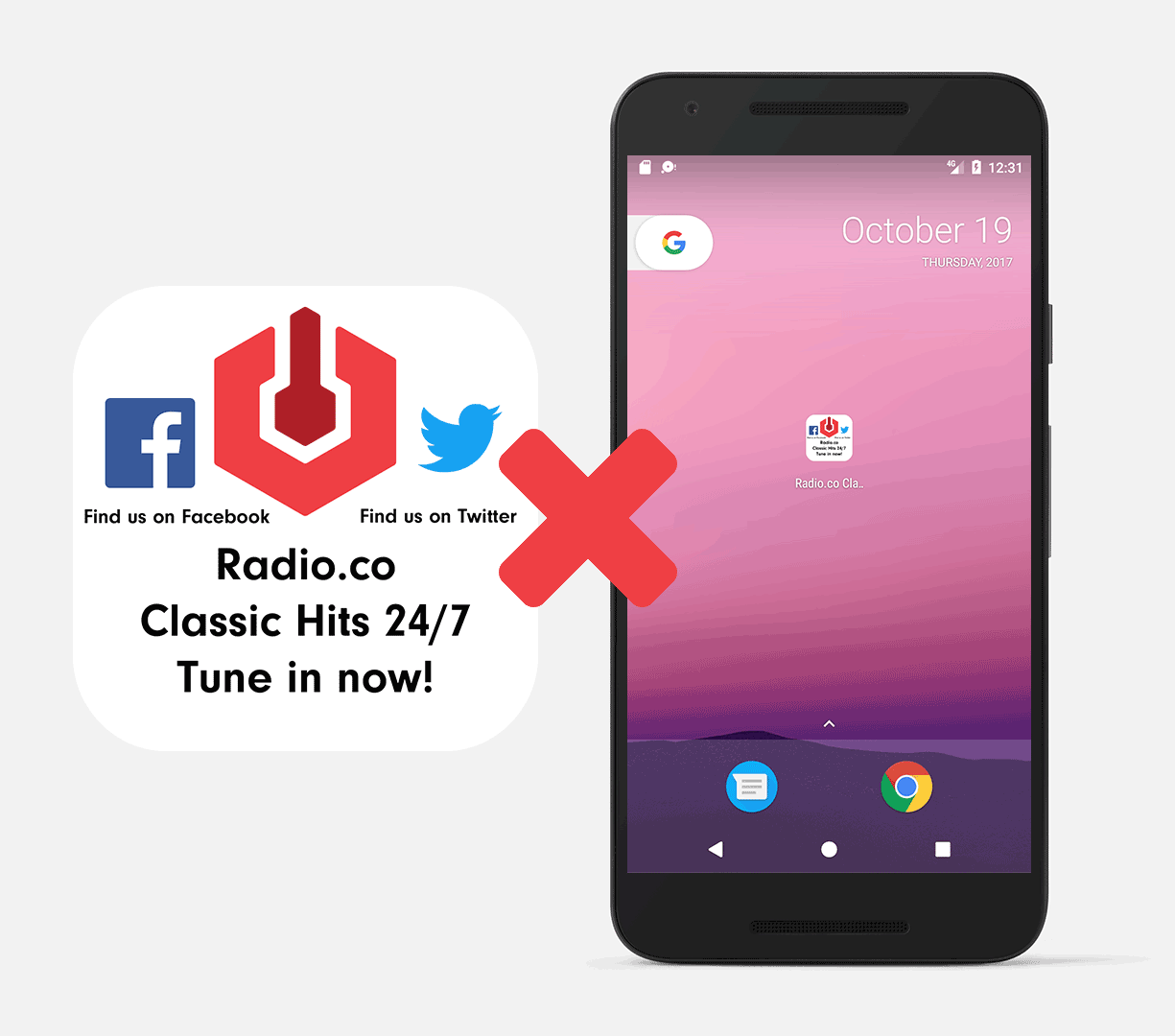
In this example, we've added way too much information. As this icon is only going to be tiny on the user's screen, they may not be able to see all of the extra, unnecessary information and logos. For your icon, you want to focus on your station's brand only. Ensure that you don't have any social media icons or extra wording than necessary (these can be set up in the sidebar, a more natural location). That way, we can emphasise our logo and make it clear to the user what the app is.
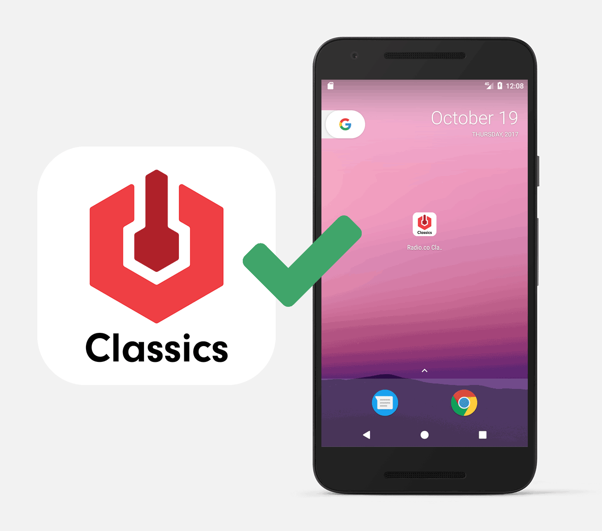
Here, you can see that I've stripped out all of the unnecessary information and the icon looks much cleaner as a result. This looks much better on our user's device too. After we've finished and we're happy, we need to save the image in PNG format.
Designing Your In-App Logo
Next up, we want to work on the logo. This should be 1024 x 1024 pixels in size. This will be shown in the app, above the currently playing track artwork. Again, you want to keep this simple but you can include a little more information here as this will appear slightly larger on the user's screen. Make sure you don't include too much though, as it will still look cluttered:
The logo would also look better with a transparent background. In the following example, I've removed some of the wording and removed the white background too, to ensure that it looks nice later on.
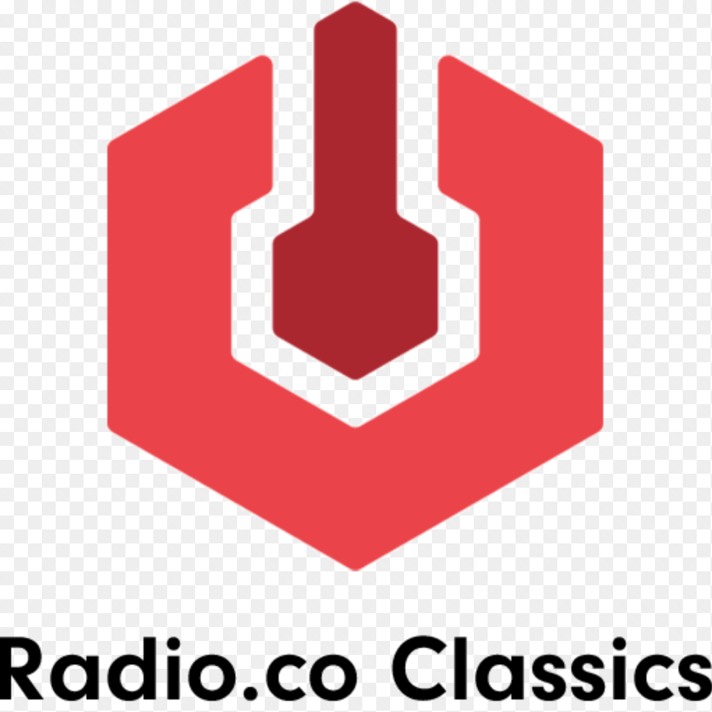
When you're finished with the logo, this needs to be saved in PNG format.
Designing Your App's Background
The last image we need to create is the Background image. The background image should be 1024 x 1024 pixels in size. As this will be placed behind everything else in the app, we don't want to have too much information here. For example, we don't need any wording or social media icons as these won't be seen very well on most devices.
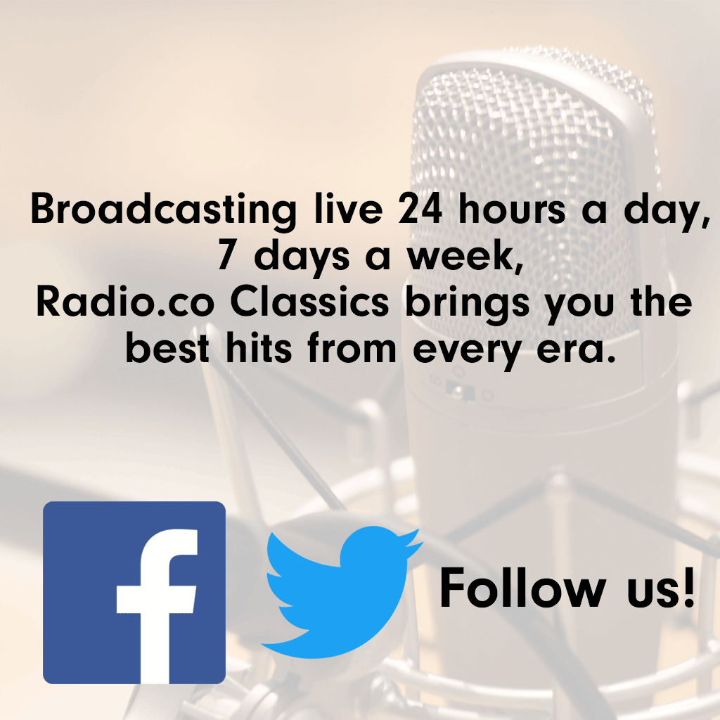
Therefore, I've removed all of the wording and the social media icons. This is the background image I've ended up with to finish my Radio App Design:
Now that I'm happy with the background, this also needs saving in PNG format.
Uploading Your App
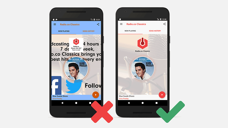
Finally - we're ready to start uploading your Radio App Design to the App Builder and start choosing our colour scheme. For your colour scheme, you want to stick to brand colours that contrast well with each other. In this screenshot, you can see what a poor choice of colour scheme, along with all of the other poor design choices we've looked at here actually look like together. Warning - it's not great.
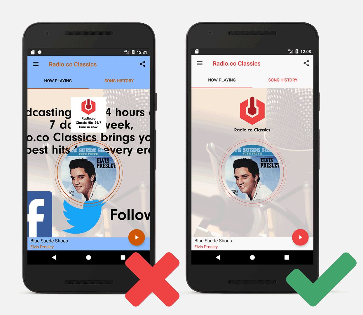
Not to worry! We've prepared our proper images and we've chosen a suitable colour scheme to match our brand and the theme of the app. Have a look at the results of the design choices we've made above on the right.
As you can see, it's a much cleaner app and looks much more pleasant to your listeners. Have you seen a tip here that you'd like to change in your app? Luckily, the Radio.co App Builder allows you to make changes to your Radio App Design such as those described in this guide quickly and easily. You can change the Logo, Background and colour scheme without needing to update your app. Just head over to the Add-Ons section of your account to make any changes necessary.
Radio App Design: Start Building Your App Today
Have you not got your own iOS or Android apps yet? At Radio.co we can help. Build your apps with us and get them listed on The App Store and Google Play in no time. There is no code involved and no technical headaches as we do all the heavy lifting!
You can begin creating your new apps right away:
- Login to your Radio.co Dashboard.
- Go to Add Ons, then choose either the iOS or Android app.
- Submit your details by following this guide.
Are you new to Radio.co? Start your 7 day free trial and build your apps by following the steps above.