Need advice? Let's talk.
Get straightforward guidance from your broadcasting partner. Schedule a call to chat with the team about your radio station.
Book DemoWhy Do Radio Websites Matter?
Radio websites matter, they are the driving force to getting new listeners and growing your station's brand. Here's why you should run your own website.

If you're running a radio station and don’t have an accompanying website, you could be shutting your station off from a large number of listeners and endangering the reach of your radio station.
But first, take a quick look at what's involved in starting your own website.
Are You at Risk?
Some common places for hosting radio stations like iTunes, TuneIn, and Stitcher, have admitted that they will no longer be accepting new radio stations onto the platform. This means that some of the most popular directories are inaccessible for broadcasters like yourself.
If your stream ever goes down and these platforms pick that up, you may be removed (TuneIn seem to be doing this to reduce the amount of radio stations on their platform). It’s unclear as to why places like TuneIn are not accepting new stations. Some believe they are cleaning out unlicensed stations or those that don’t pull in a large enough listener count. In any case, it's best not to put all your eggs in one basket.
Why Do Radio Websites Matter?
Relying on third-party radio directories can sometimes be a problem. What if one day they decide to stop listing your radio station? Even if you're listed on dozens of internet radio directories, it's best to have a place you can control (and call home).
Radio websites are essentially a failsafe as you control what goes on under the hood and how everything looks and feels. However, this is can be a double-edged sword as have to put the work in to make it the way you want it. But by using a website builder CMS (Computer Management System), you can manage your site's content easily. Just take a look at MCR Live for example, they regularly add new articles, podcasts, and fresh content without much fuss using a CMS.
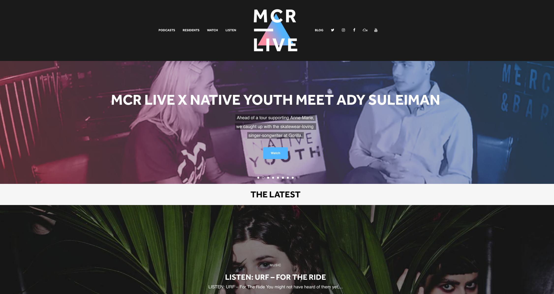
One of the major perks of running your own site is you get to inject some personality using your own custom branding. Plus, there's a bunch more useful benefits you should know about from owning a radio website.
Persistent Radio Players for Easy Accessibility
Internet radio directories are fantastic places to get discovered, but you can often get buried under the thousands of other stations already on there.
Customise your website so your station is front and centre on every page, that way listeners will be able to tune in without aimlessly wandering around your site. A good rule of thumb is, the less clicks/taps it takes to tune in, the better!
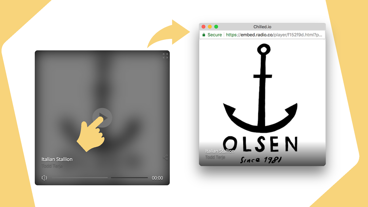
Listeners don't often stick around for long, so use the pop-out option in Radio.co to create persistent radio players. Here's how you can create and add them to your website:
Reducing Wait Time to Keep Listeners Engaged
People like fast websites. According to Google via Hobo Web, 53% of visits are abandoned if a site takes longer than 3 seconds to load.
As nobody wants to wait around, it's best to reduce wait time to keep listeners engaged. The biggest advantage you have over big radio station websites and directories is that they can be bloated with ads, large images, videos, and other things to slow down pages. For example, BBC 5 live is a bit slow due to it's heavy use of image and long-form page. Whereas Kiss is faster as it has fewer assets and uses a short-form page.
A fresh new website opens up the door for people to easily discover what you're about, browse your content, and tune into your shows. Just remember to reduce load times by keeping it simple.
Keeping it Simple for Newcomers
It doesn't take much for new visitors to leave your website. As mentioned earlier, slow pages are real road blocks for people looking to browse your site, but complex pages stuffed with to the brim are just as worse. That's why you shouldn't overcrowd your website with information.
It can be tempting to show off new shows, competitions, paid ads, and everything else happening at your station, but this doesn't mean you have to showcase every piece of content front and centre. Just take a look at Capital FM, if you scroll down the homepage you get lost in a sea of articles and ads.
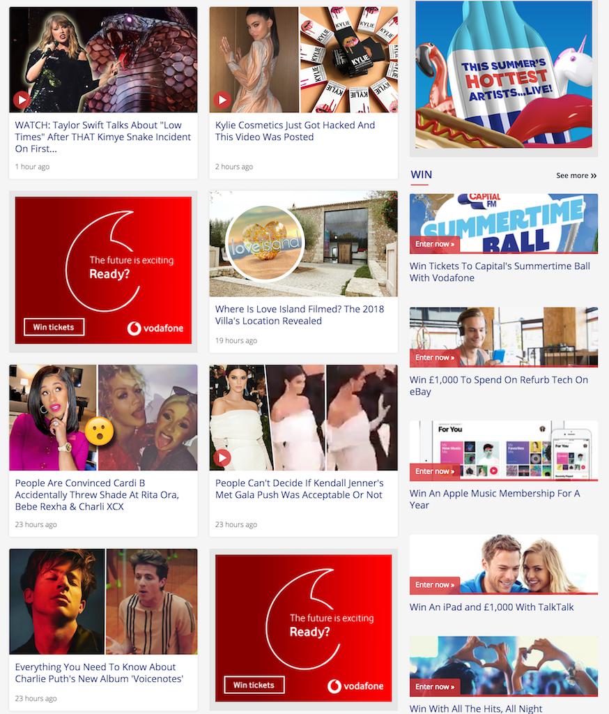
Sites like this just look messy and aimless. By simplifying pages and spreading out content it makes things more manageable, not just for you but for newcomers discovering content. Take a look at London Fields Radio for example - it's simple in design, easy to find content like new shows, and listeners can tune in easily as the player is available on every page.
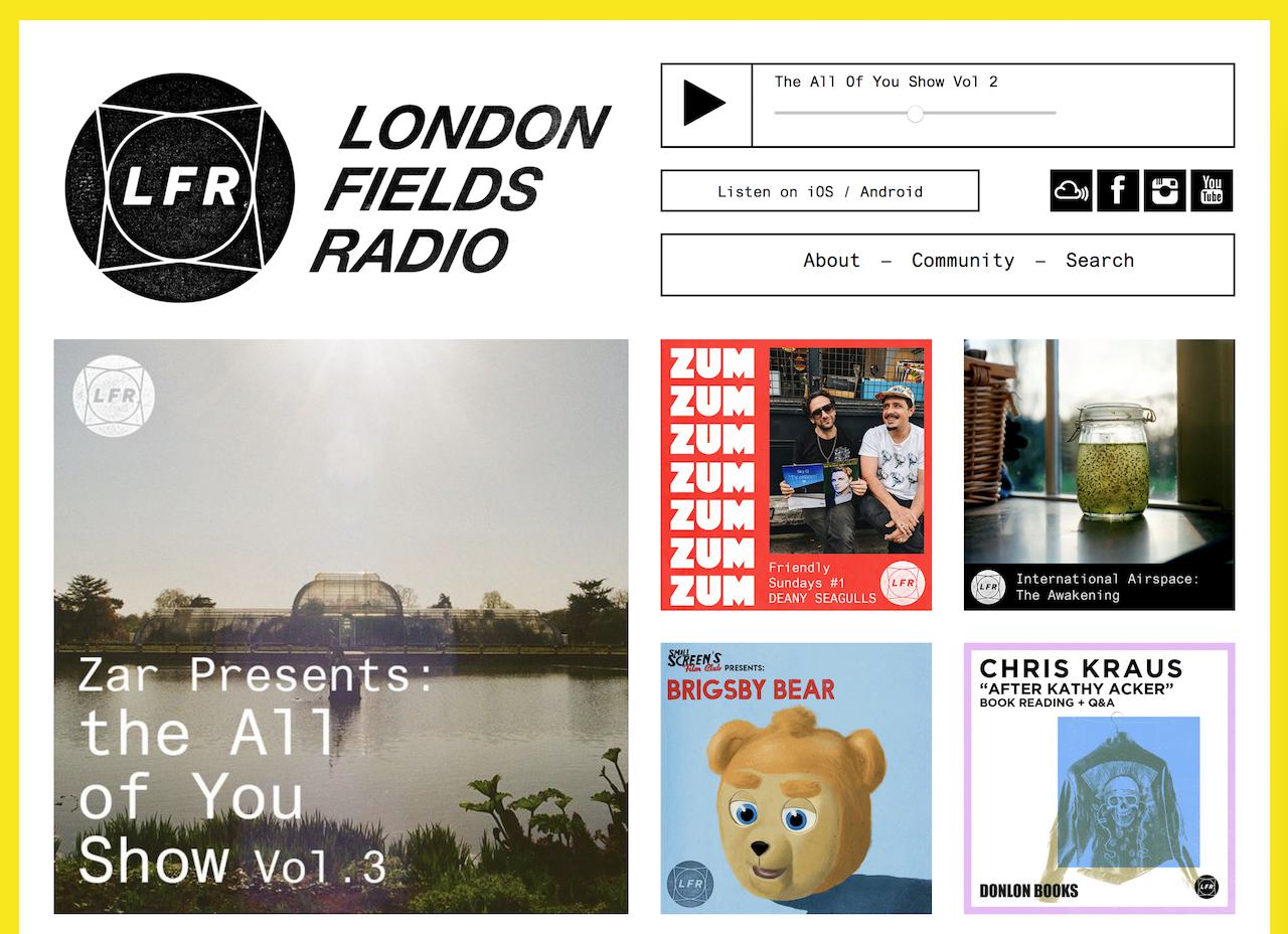
Simple websites like this often inject personality into pages through their own branding, more specifically by using a colour scheme for brand awareness.
Defining Your Website's Identity with Brand Colours
Radio websites (and stations themselves for that matter) have their own unique identity to stick in people's minds. For example, when thinking of BBC Radio 1, black and white colours with a large number 1 usually springs to mind.

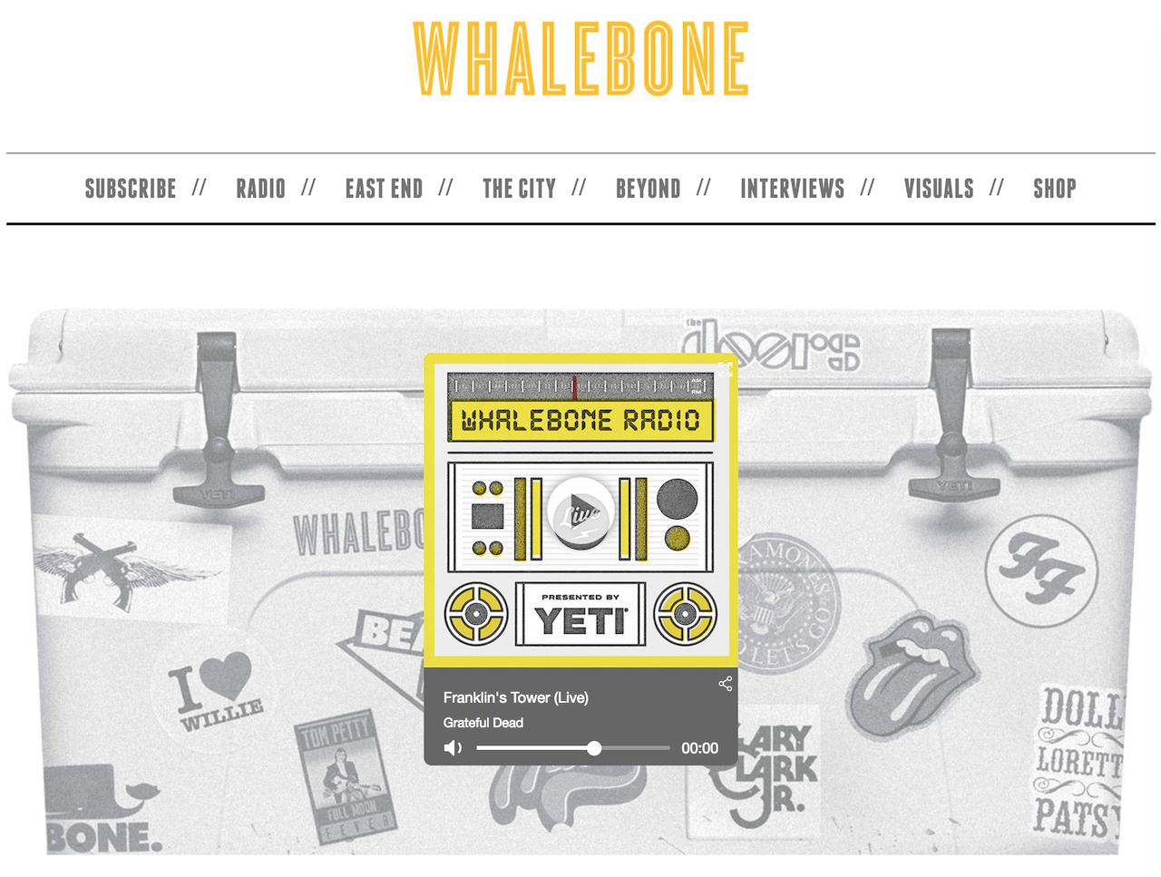
The point is, colours on your website are an extension of your brand. Take the time to pick a colour scheme and aesthetic that visitors will remember. Take Whalebone Magazine, a magazine and online store that run their own radio station. Yellow, white, and grey branding runs throughout the site, so it's consistent and feels like an experience rather than a disjointed mess.
Responsive & Mobile Friendly Content
Websites that look nice on desktop, might look awful on smaller screens. Content that isn't responsive, like images, videos, and other assets that live on pages, don't resize to fit small sized screens like a Samsung Galaxy S9 for example.
Most CMS and website builders have responsiveness built into their structure, so people viewing a blog post or about us page can see everything without content being distorted or inaccessible.
Modern radio station websites have mobile friendly pages. Take MCR Live again for example. Their listen page looks exactly the same on desktop as it does on mobile so you can view everything easily. Here's what the desktop version looks like:
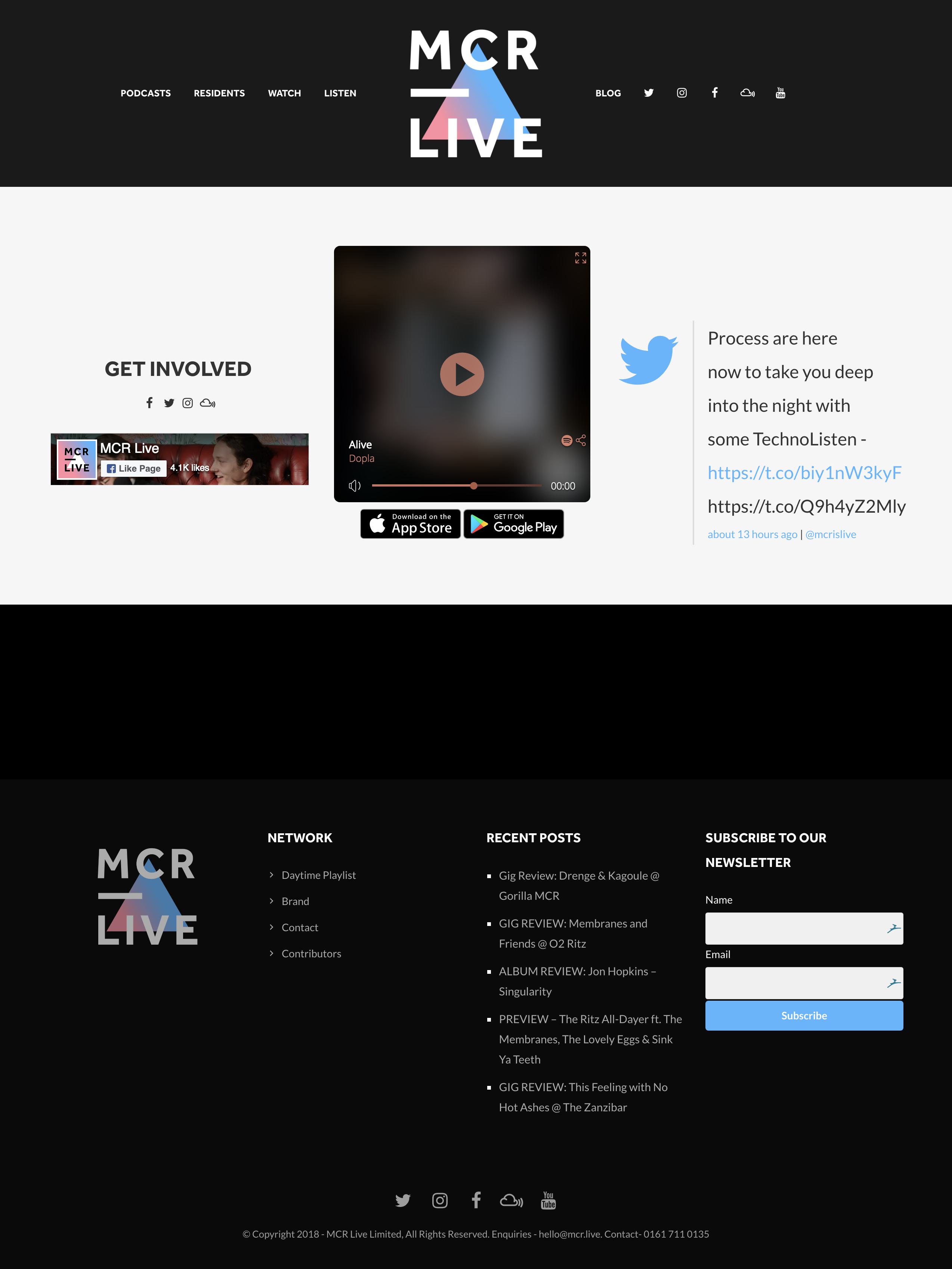
Here's what the mobile version looks like:

Everything is where it should be, albeit much more enlarged. The point is, listeners discovering your website should be able to view content no matter what sized screen they're using.
Starting a Newsletter to Increase Engagement
Once listeners tune out of your radio station, they're out of reach (some are even gone for good). A regular newsletter is good practice to keep listeners engaged. By capturing emails on your website you can convert those people back into listeners and maybe even into customers if you sell goods.

Successful radio stations use this technique to grow their audience and attract a bigger following. Not just with email, but on social platforms, during live events, and through promotions. For more on this check out:
The Secrets of Successful Radio Stations
Using a Simple Website Builder for Easy Content Management
Finally, if you are uncertain on how to setup a website, try using simple website builders like Wix, WordPress, or if you're with Radio.co then use the Radio Website Builder.
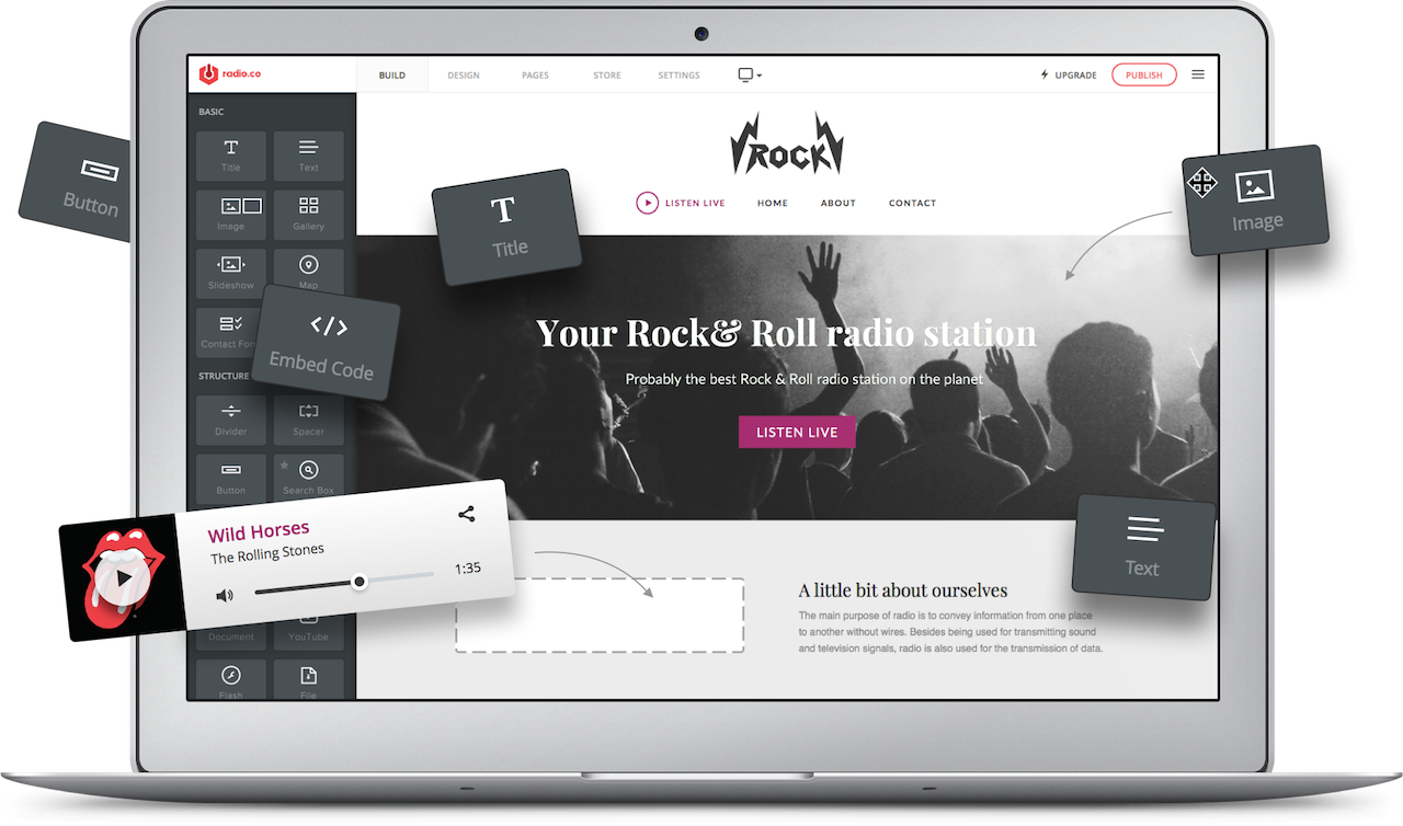
Built with tools to help you make your site more appealing, there's no code to learn and nothing too technical to get our head around. With these simple website creators, you just drag and drop what you want on your site, onto the page and it appears ready for you to adjust to your stations aesthetic.
Hopefully, that’s given you a few things to think about when creating your own radio website. Got a question about setting up a website? Then feel free to contact us at studio@radio.co. Alternatively, why not start building your own website today using the Radio.co Website Builder.

